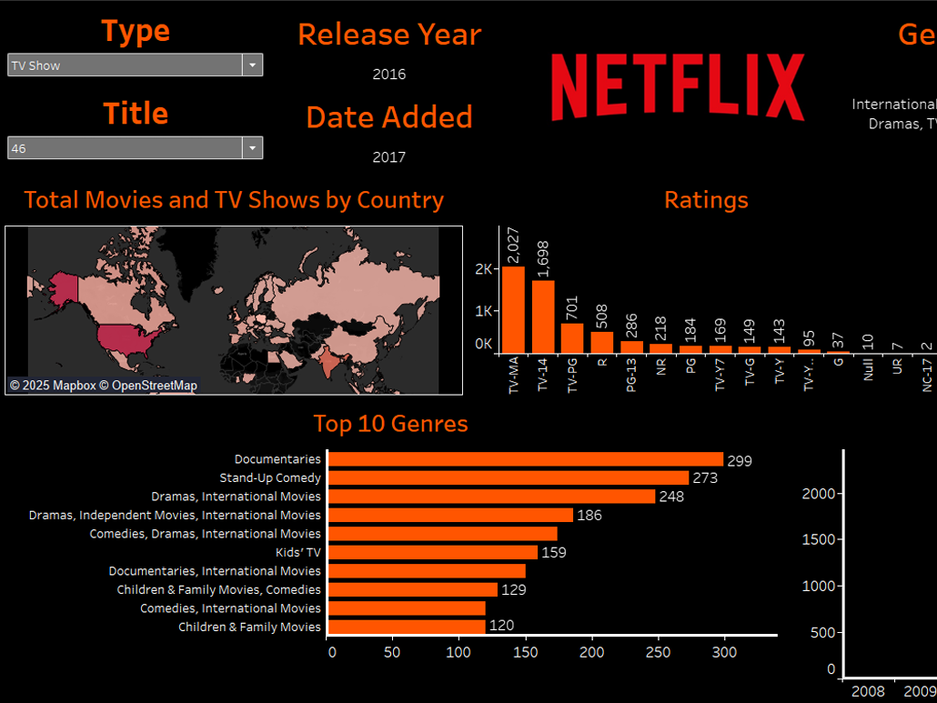
This was a group project during my 2025 Spring Semester where I took the lead creating the dashboard seen below, and cultivating two charts seen under the "Sentencing by Region/Age/Education" tab.
(A link to the project can be found on the right, also published on my GitHub page)


One of the two charts I made for this project is seen above. As a challenge to myself, I set out to create a circular bar plot since I'd felt so familiarized with traditional bar plots (and most other plots for that matter) in R. The result above is a culmination of lots of fine tuning, data parsing, and lots of cleanup to arrive at the finished product.