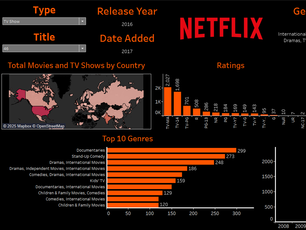
This was a final project for a Visual Analytics course I took at SU. The dashboard represents the culmination of many weeks of data parsing, cleaning, planning, and alteration. The visual elements were all thought out with an imaginary end-user in mind.
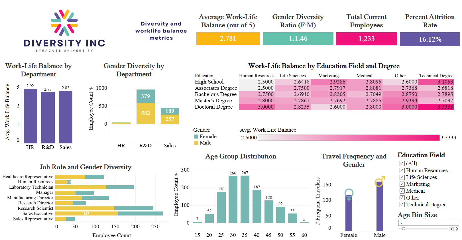
One of my favorite aspects of this project came unexpectedly after I already created all the core visuals. I realized that it presented an opportunity to cultivate the dashboard visually to convey a message. This was a facet of client-facing deliverables that I had often overlooked. So, I spent a large chunk of time at the end creating a custom logo for the company, finding a color palette that fit the org's values, and presented the visuals in an all-in-one dashboard format.